How does Boston know when and where people are biking?
This article is the first in a new series of analysis from a volunteer-lead group BCU Labs. BCU Labs seeks to draw insight and tell stories from the wealth of biking data in Boston. Our mission is to leverage the power of data through creative experimentation, and learn where Boston can improve its infrastructure, whether physical or digital, and continue to empower BCU’s advocacy one pedal at a time. Through our framework of mobility justice and equity, we strive to push for positive change in our bike networks, neighborhoods and mindsets for every body, no matter who you are or where you ride.
We often talk about all the people that bike throughout the city and region; sometimes we want to share the stories of individuals and what biking means to them personally, but other times we need to look at a little higher level to understand where people are biking.
Unfortunately, there is no easy answer to this article’s headline. Luckily, there are numerous data sources that do count people biking throughout the region in different ways. We will try to highlight some of the best sources of bike counts and how they differ. This article is just our beginning, over time we will dive even further into the data.
City bike counts (Boston, Cambridge, Somerville, Quincy, others?)
Boston and a few of its neighbor cities regularly conduct manual bike counts throughout their respective cities. The cities use these counts to track bike volumes over the years and are able to track how they are progressing on their mobility, environmental, and equity goals. For example, Boston, through Go Boston 2030, has the goal to quadruple bike ridership within the city. These counts are how the city can track against this goal. From the data, they are able to dig deeper and see what changes are having the most impact to reach this goal.
The cities that are performing these regular counts will be able to accurately evaluate how they are progressing towards safer biking infrastructure and have a better understanding of how people move within their city. Similarly, the public can see with these bike counts where the city has misallocated street space, as exemplified in this StreetsblogMass article, and where the city is failing to make changes at the scale needed to achieve its goals, as seen with the recent Cambridge St. changes.
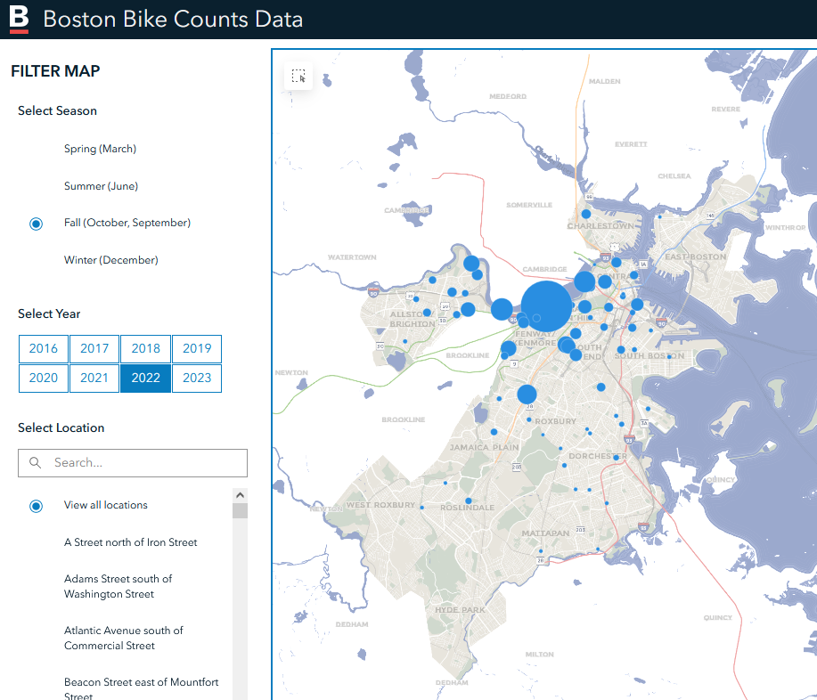
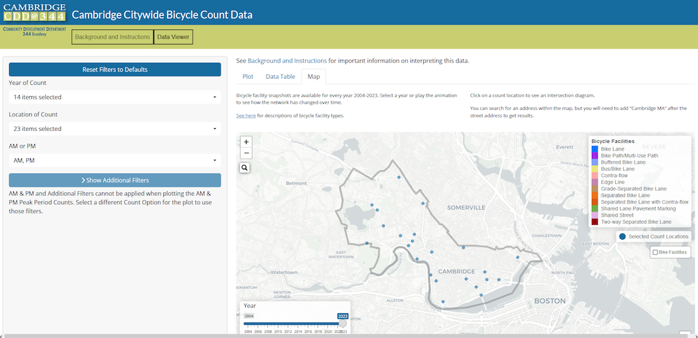
Boston has an excellent dashboard, seen below, where you can explore individual count locations back to 2016, the beginning of their use of automated counters for bike counts. Cambridge has manual counts with some intersections going back to 2003 and a similar dashboard to explore their counts. Somerville and Quincy don’t have nice dashboards but the data is available. We have been unable to find other cities that are performing and collecting bike counts.
Automated counters
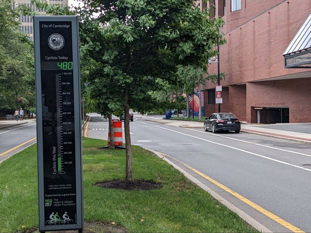
In addition to performing regular counts, cities and the state have some permanent counters that count bikes throughout the day year-round. Both Boston (Causeway St.) and Cambridge (Broadway) have counters that display the number of riders each day in real time. Along many of the bike trails in the region (Minuteman, Northern Strand, Neponset Greenway) and bridges crossing the Charles River (BU, Harvard/Mass Ave, Longfellow, Museum of Science) the state has counters with data published to a state database in 15-minute intervals. The city installed many of these counters were installed this year, showing promise that they will build even more counters in the future.
These counters are more expensive and less flexible than the short-term counts cities perform, but have much more detailed data throughout the year at their specific location. From here, we can see more short-term impacts on biking, e.g. construction, weather, changes in street design, or even major events or holidays. Combining both types of counts can allow us to better understand more of the city and extrapolate better how manual counts reflect true ridership numbers throughout the year.
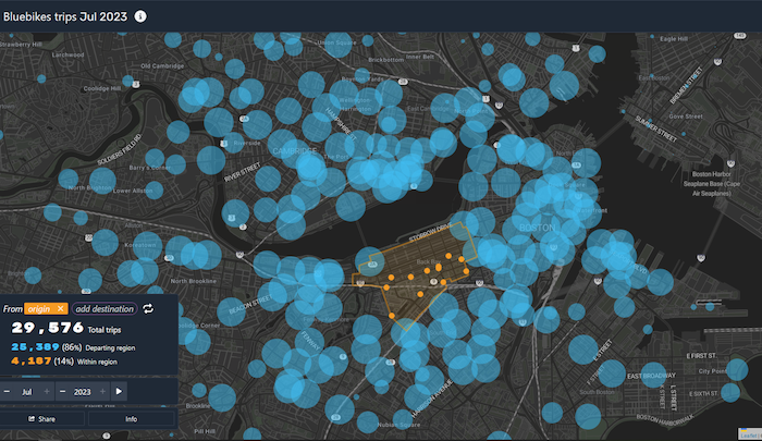
Bluebikes ride data
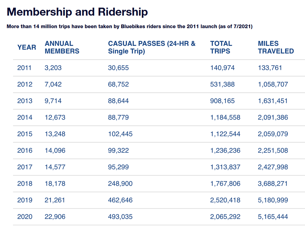
Bluebikes, our regional municipally-owned bike share system, publishes every ride taken, including starting and ending stations. With the system growing considerably for over a decade, we can see when and where people are biking throughout the system and how that has changed, both with the growth of the system itself and how the city has been improving for biking in other ways.
Patrick Cleary has created an excellent site to explore this trip data. His data allows you to see where people are coming or going from a station.
What else can we look at?
So far we have just started to look at how the number of people biking are counted, but there are a plethora of other types of information that affects how comfortable biking is or the effects of our infrastructure have on our safety biking through the region. There are still Boston’s Vision Zero Interactive Crash Map and Cambridge’s Crash Map to explore. The Federal Highway Administration (FHA) recently released a study using data from Cambridge to analyze the safety effects of different styles of bike lanes. The Census asks about people’s mode of commute to work or school, and that data is publicly available. PeopleForBikes analyzes the network of safe streets and shows for what can reasonably be biked to. This is just the tip of the iceberg. There is so much to explore and learn from, and where there are gaps, we can advocate for more data sources.
What can we do with this data?
Right now, different jurisdictions have been looking at the data these different data sources collect, but no one has taken a comprehensive look at all the data that is being collected. We in BCU Labs are building a volunteer-led group to try to start looking this comprehensive look. We plan on building dashboards and writing analysis to tell stories and advocate for safer change. If this interests you, please fill out our interest form. We are looking for help from people with different backgrounds and skill sets to build something valuable for the community.